TINY HUMANS
2017
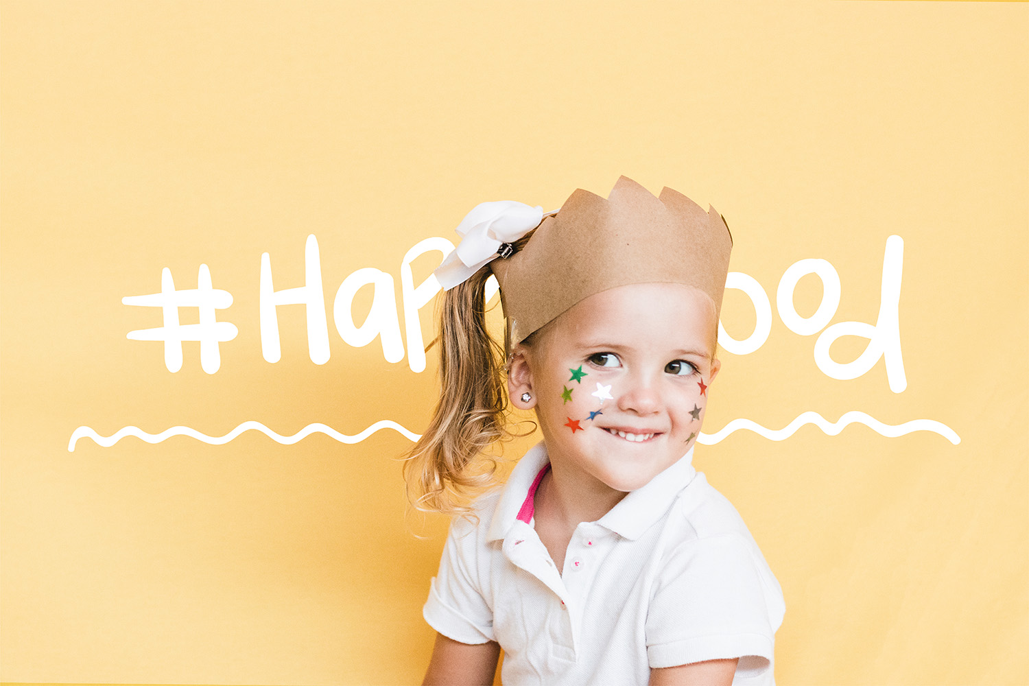
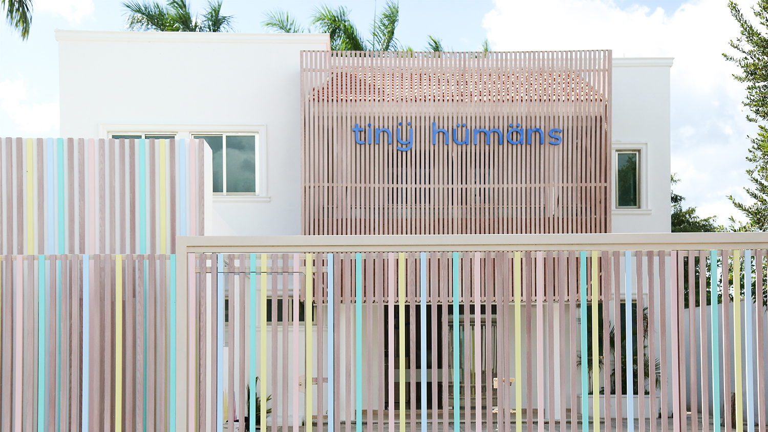
Tiny Humans is a nursery born from the idea that our current society demands a new educational vision in the family and in school.
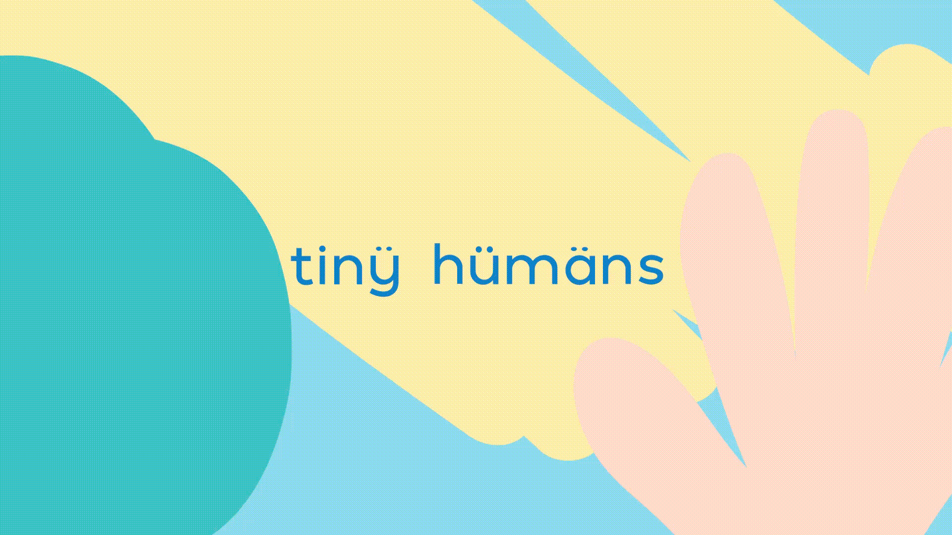
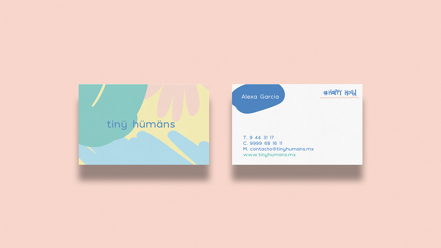
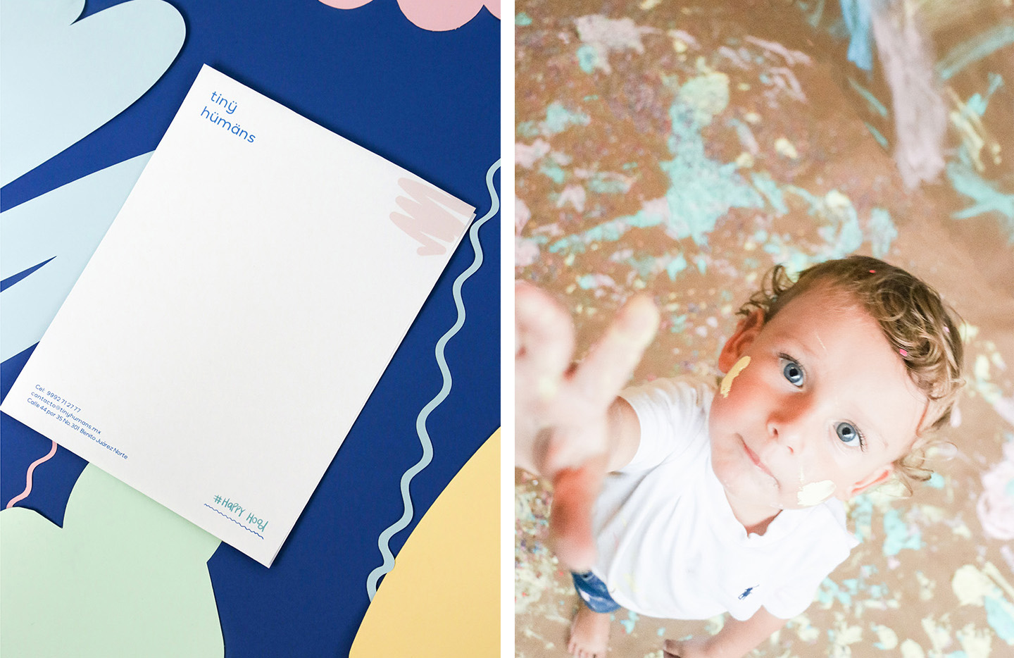
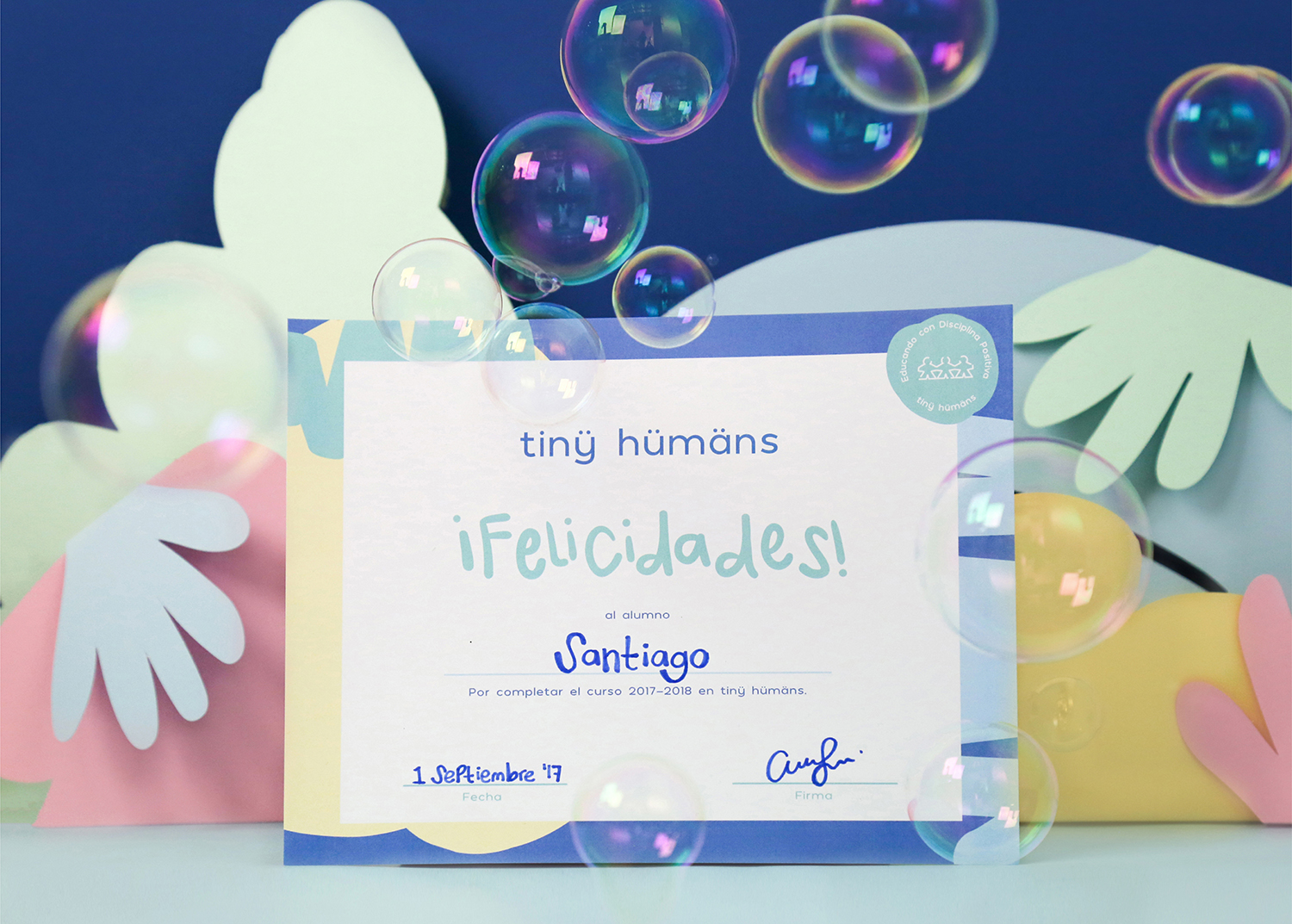
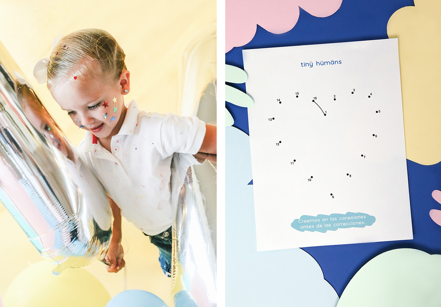
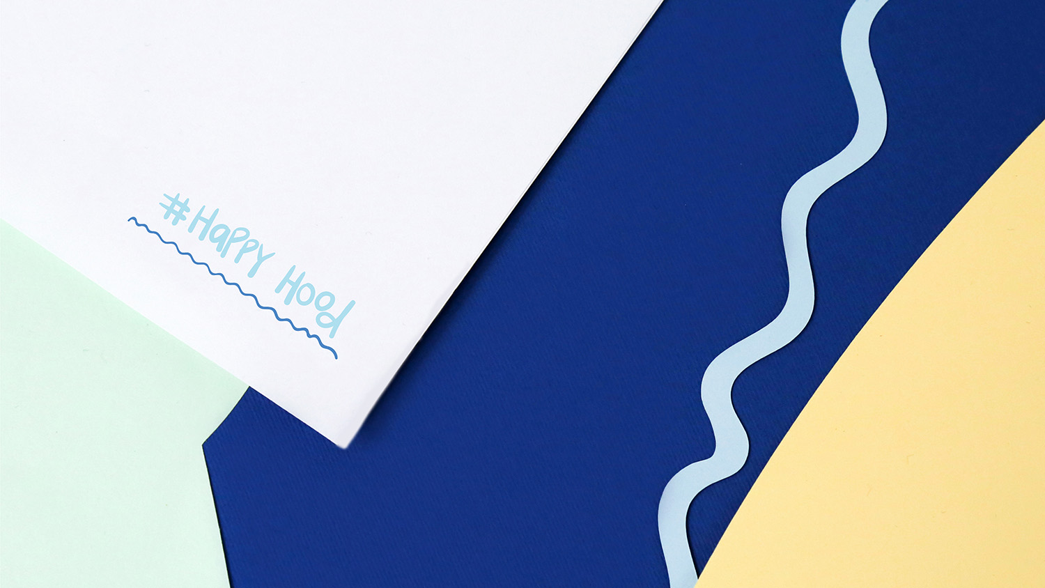
The corporate identity of Tiny Humans was based on organic figures that alluded to the strokes that children make in their early years. The simplicity of branding is reflected in the typeface used: formal, clean and understandable.
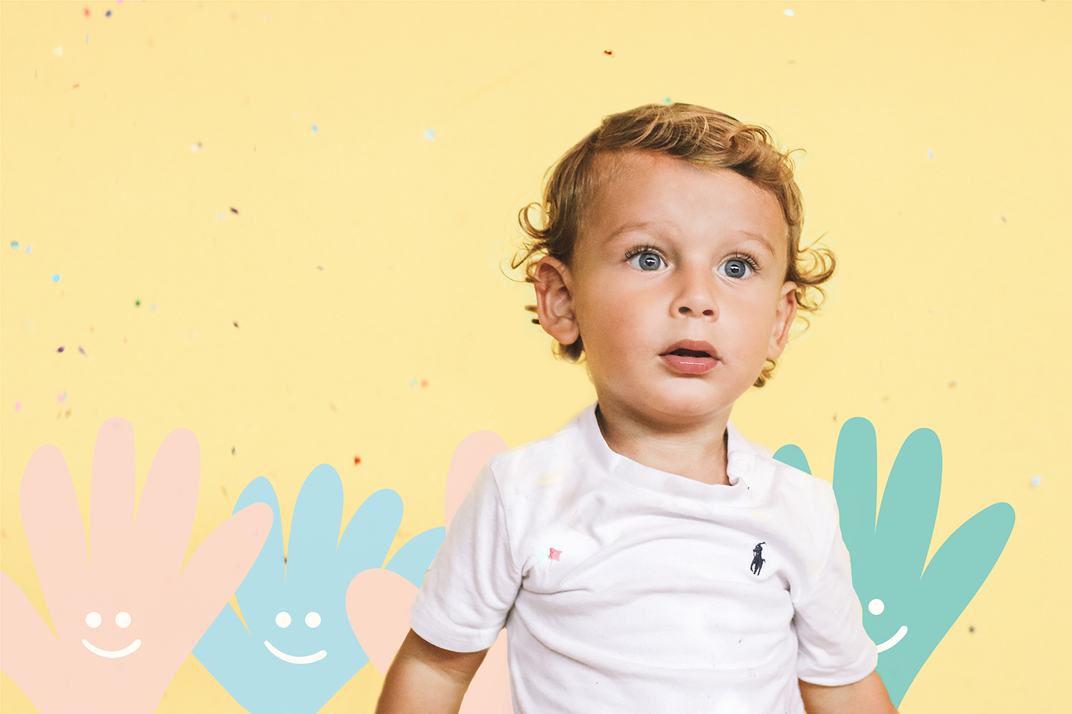
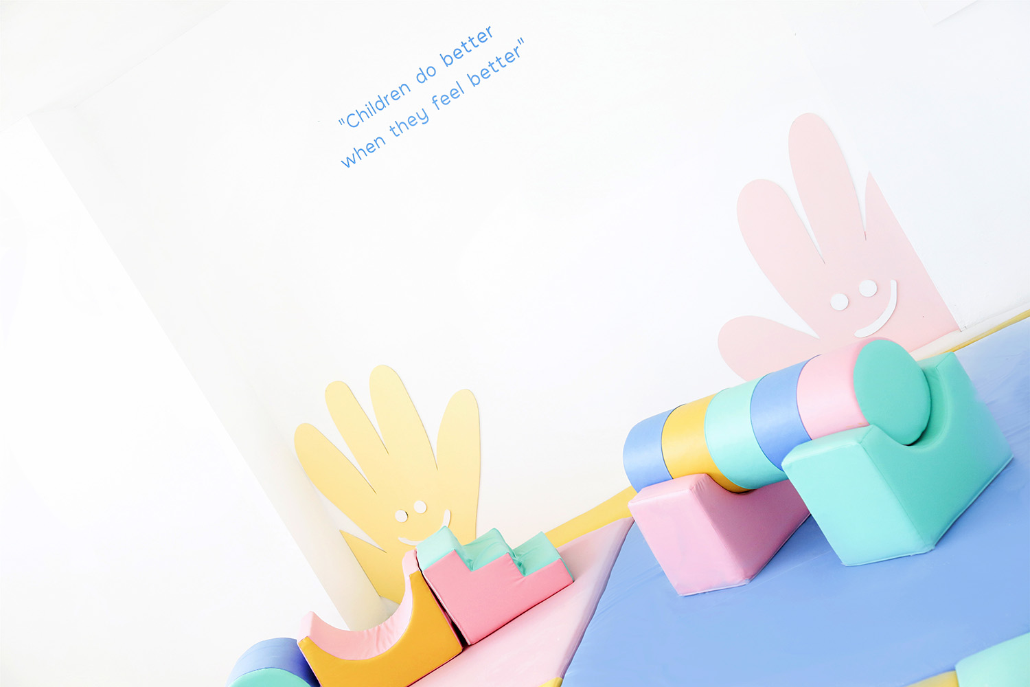
A pastel color palette was chosen with the intention of creating an environment in which children feel safe and free to grow and learn, since we firmly believe that the world today needs smaller explorers that learn trough the environment that surrounds them.
TINY HUMANS
2017
Tiny Humans es un maternal que nace de la idea de que nuestra sociedad actual demanda de una nueva visión educadora en la familia y en la escuela.
La identidad corporativa estuvo basada en figuras orgánicas que hicieran alusión a los trazos que realizan los niños en sus primeros años. La simplicidad del branding se ve reflejada en la tipografía utilizada: formal, limpia y comprensible.
Se eligió una gama de colores en tonos pastel con el objetivo de crear un ambiente en el que los niños se sientan seguros, libres de crecer y aprender, ya que creemos firmemente que hoy en día el mundo necesita de más pequeños exploradores que aprendan a través del entorno que los rodea.